
The Anatomy of Atmosphere
How Tailored Artwork Concepting Transforms Luxury Hospitality & Residential Spaces
In high-end interior architecture, a blank wall is never just an absence of matter; it is an unfulfilled narrative. Whether designing a boutique hotel lobby, a serene private estate, or an elevated Airbnb property, the modern guest and homeowner look beyond structural design, they seek an emotional ecosystem.
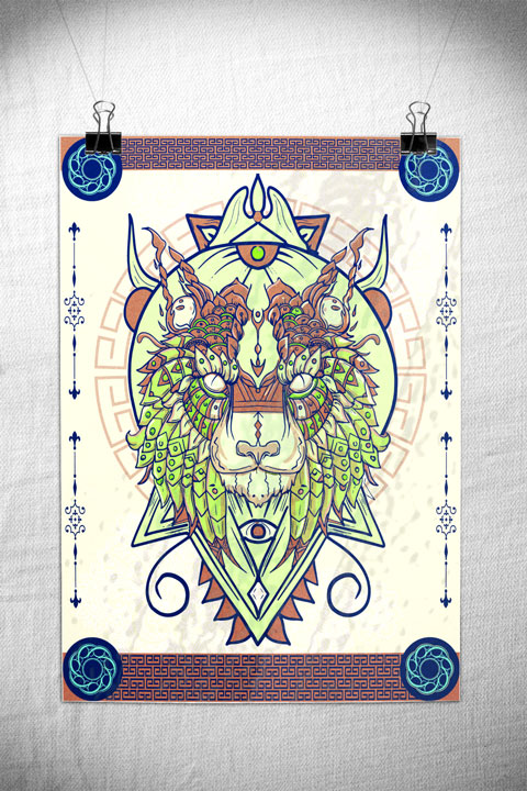
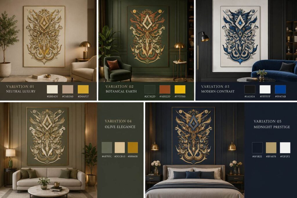
Art plays the ultimate role in synthesizing these environments. However, sourcing a piece that aligns flawlessly with pre-determined spatial materials, lighting directions, and textile choices is an age-old challenge for interior specialists. To solve this, our latest studio concept explores a singular, deeply intricate symmetry-driven artwork engineered across five distinct chromatic profiles. By mapping specific color psychology frameworks to distinct interior layouts, this project demonstrates how fine art can be tailored to complete—or completely redefine, the spatial atmosphere.
1. Curating the Chromatic Identity
A space should feel intentionally composed, from the base undertones of the walls to the focal artwork anchoring the room. Below is an analytical look at how these five conceptual variations target specific design aesthetics, offering developers and spatial planners a plug-and-play visual anchor.
Variation 01: Neutral Luxury
-
Palette Highlights: Parchment/Cream (
#EBE4D1), Muted Taupe (#C6B3A0), Ochre Gold (#D4AF37) -
Best Suited For: High-end residential living rooms, minimalist hotel lounges, and light-filled cream/travertine architectural spaces.
-
Atmosphere: Understated, warm, calming, and deeply grounded. The soft parchment backdrop paired with muted taupe blends seamlessly into alabaster or plaster finishes, while the fine ochre-gold accents elegantly catch directional gallery lighting.
Variation 02: Botanical Earth
-
Palette Highlights: Deep Forest Green (
#2C3E2D), Terracotta Rust (#A0522D), Saffron Yellow (#FFD700) -
Best Suited For: Biophilic spaces, upscale woodland retreats, executive dens, or libraries seeking an organic, grounding focal point.
-
Atmosphere: Rich and rooted. This variation integrates deep forest greens with warm terracotta tones, establishing an immediate connection with the raw natural world. The vibrant saffron elements bring an unmissable spark of life to deeply saturated accent walls.
Variation 03: Modern Contrast
-
Palette Highlights: Velvet Black (
#1A1A1A), Crisp White (#FFFFFF), Cobalt Blue (#0047AB) -
Best Suited For: Urban penthouses, ultra-modern corporate lobbies, or premium metropolitan Airbnbs featuring industrial elements or monochrome styling.
-
Atmosphere: Striking, avant-garde, and confident. The stark interplay between pure velvet black and crisp white provides heavy graphic definition, while the electric cobalt blue cuts through the space as an unforgettable signature statement.
Variation 04: Olive Elegance
-
Palette Highlights: Sage/Olive (
#6B705C), Antique Cream (#DCC8A3), Dark Antique Gold (#B8860B) -
Best Suited For: Mid-century modern properties, boutique hotel suites, and settings utilizing natural oak, walnut, or brushed brass hardware.
-
Atmosphere: Sophisticated, vintage-leaning, and serene. Sage and sage-adjacent olive greens bring an immediate sense of rest, while the antique cream and dark gold elements enrich the linework to echo mid-century luxury.
Variation 05: Midnight Prestige
-
Palette Highlights: Midnight Navy (
#0F1B2E), Champagne Gold (#BFA878), Pure Silver White (#F2F2F2) -
Best Suited For: Master bedrooms, exclusive cocktail bars, executive hotel lounges, or dark, moody hospitality corridors.
-
Atmosphere: Regal, intimate, and mysterious. Deep indigo and midnight navy recede beautifully into the shadows, allowing the warm champagne gold and crisp silver-white accents to guide the eye across the mesmerizing symmetry of the artwork.
2. Solving the Scale & Cohesion Problem
For project specifiers, hospitality operators, and interior designers, visual consistency across a multi-room project is critical. One of the greatest benefits of this concept framework is its modular cohesion. A hotel property can easily utilize Variation 01 within its bright, open reception hall, transition to Variation 04 inside the guest suites to induce calm, and place Variation 05 in late-night lounge bars.
Because the core graphic language remains perfectly uniform, the property maintains an overarching visual thread and a unified brand identity, while simultaneously honoring the distinct functional moods of individual rooms.
Bespoke Art Commissioning & Commercial Licensing Are you currently specifying artwork for an upcoming residential project, boutique hotel build, or premium rental property? These concepts are fully adaptable. I specialize in collaborating directly with design houses to alter scale, fine-tune exact hex color codes to match your textile swatches, and deliver ready-to-frame premium finishes or digital commercial licensing.
Let’s connect: Get in touch directly via the website contact portal to request custom color-mapping mockups for your current active moodboards.
Join the Inner Circle
Subscribe to receive exclusive artwork previews, studio updates, and event invitations directly in your inbox.
[hubspot type="form" portal="48496408" id="2a377f19-80c3-48fe-9c1b-48ee00216cd8"]